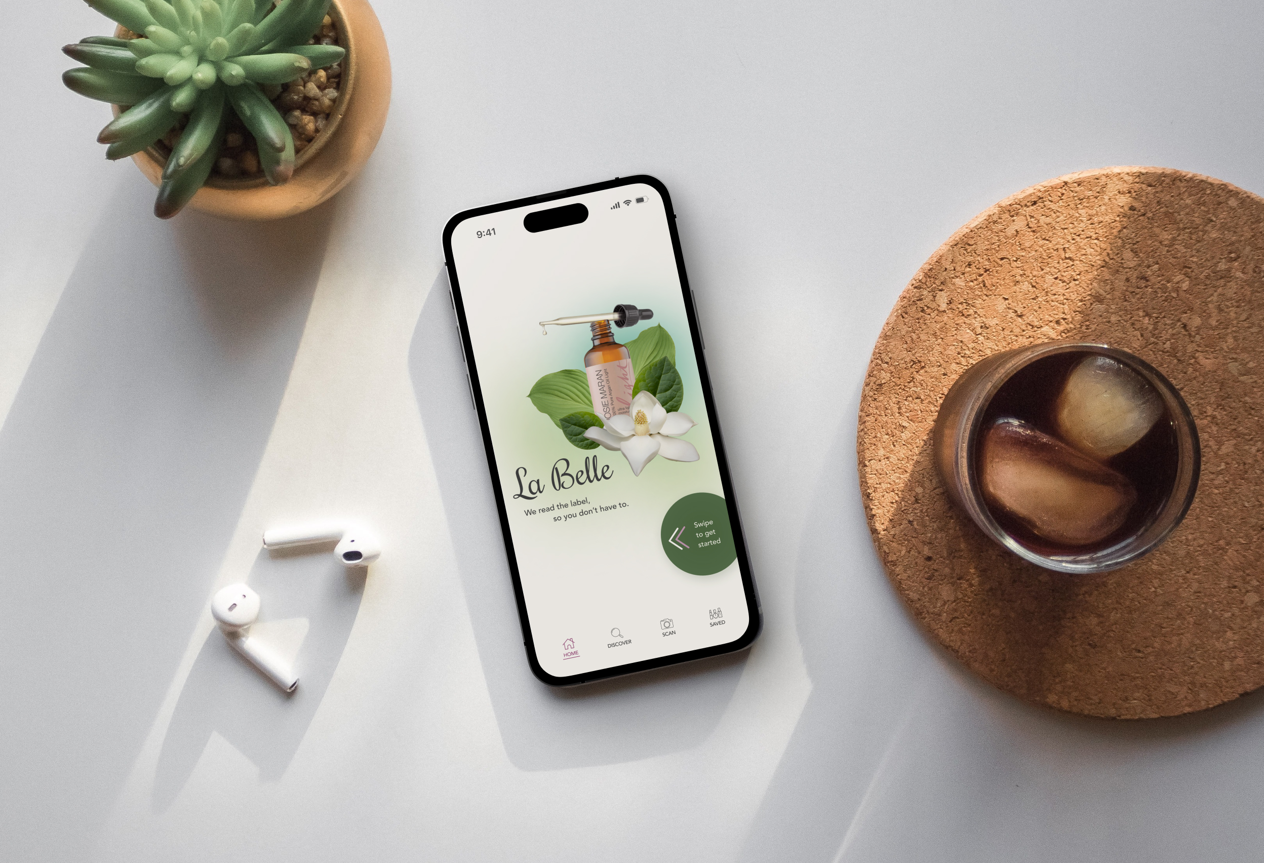
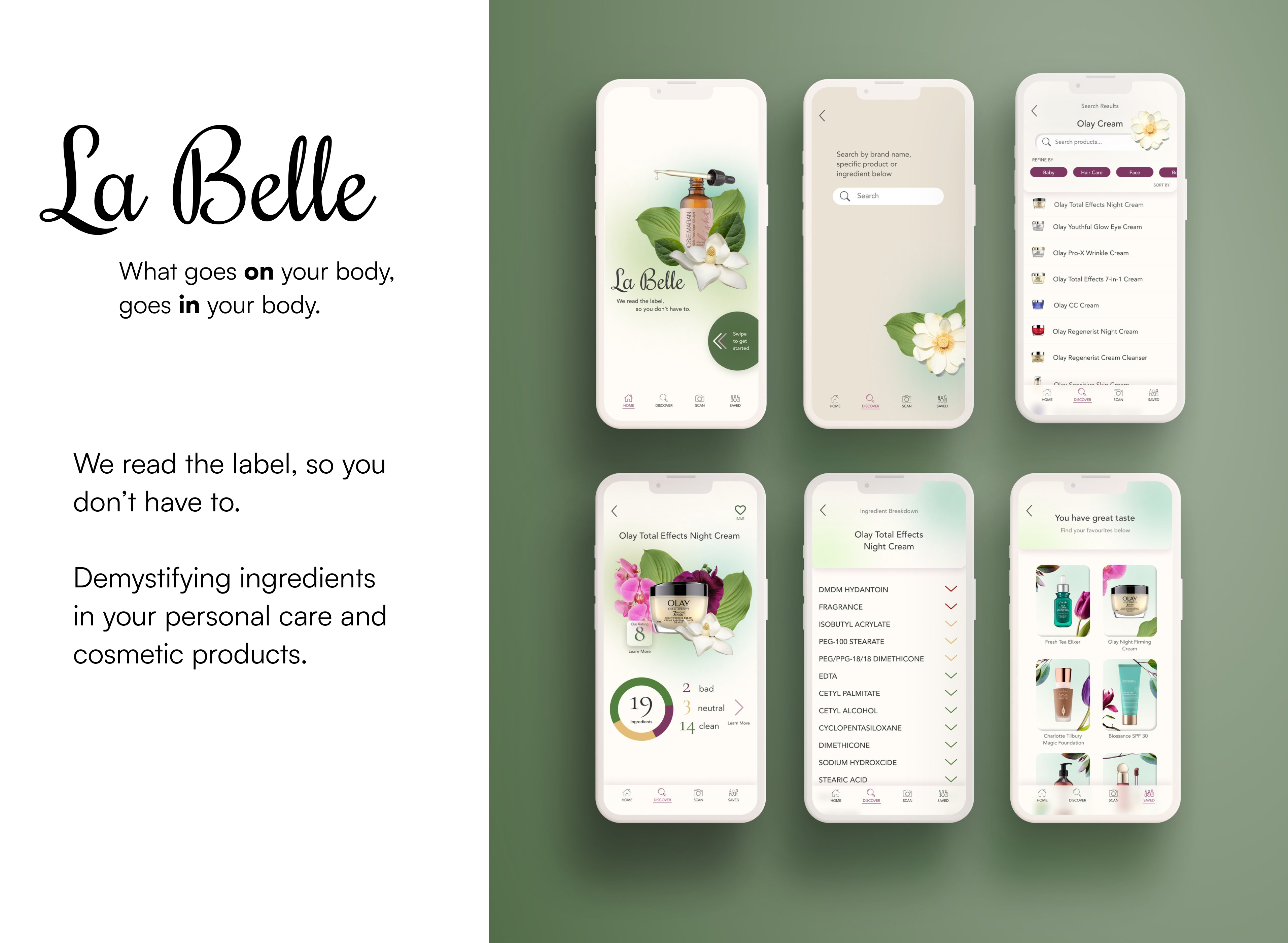
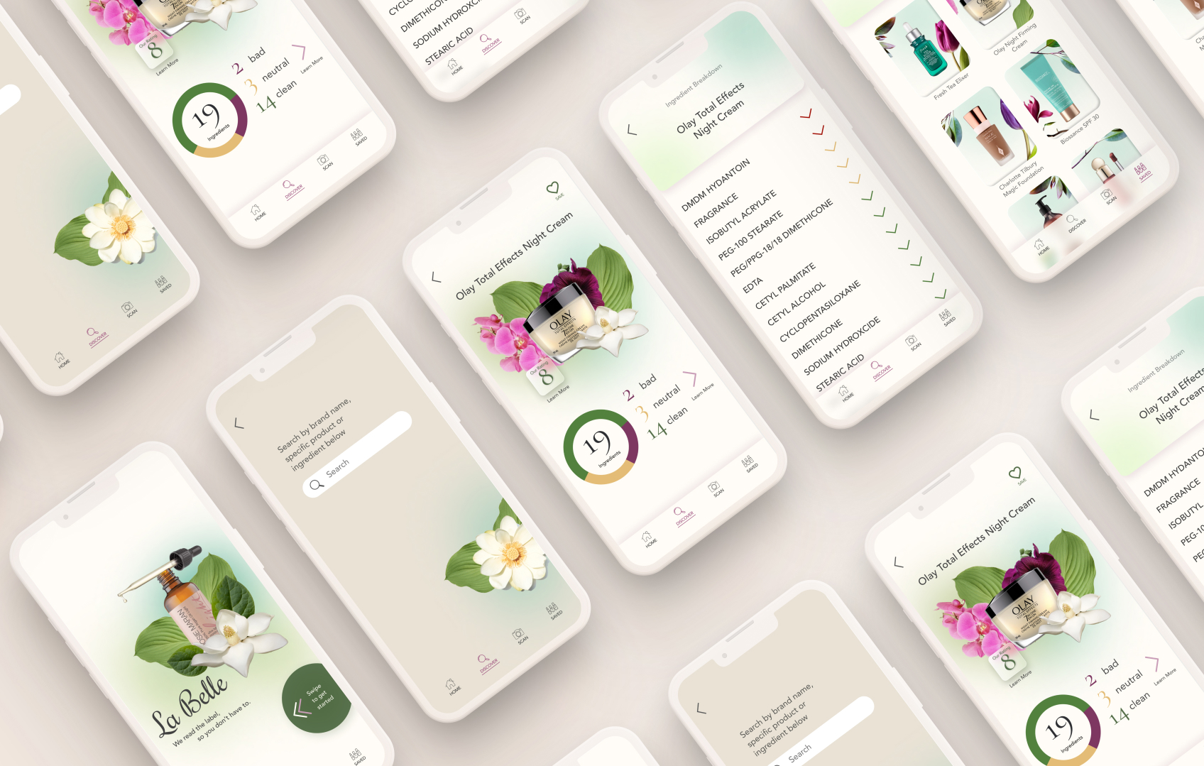
Tasked with completing a 10-week capstone project, I created La Belle, an application that breaks down labels into human-readable terms. I utilized my skills in UX Research, design thinking, wireframing, user testing, and prototyping.
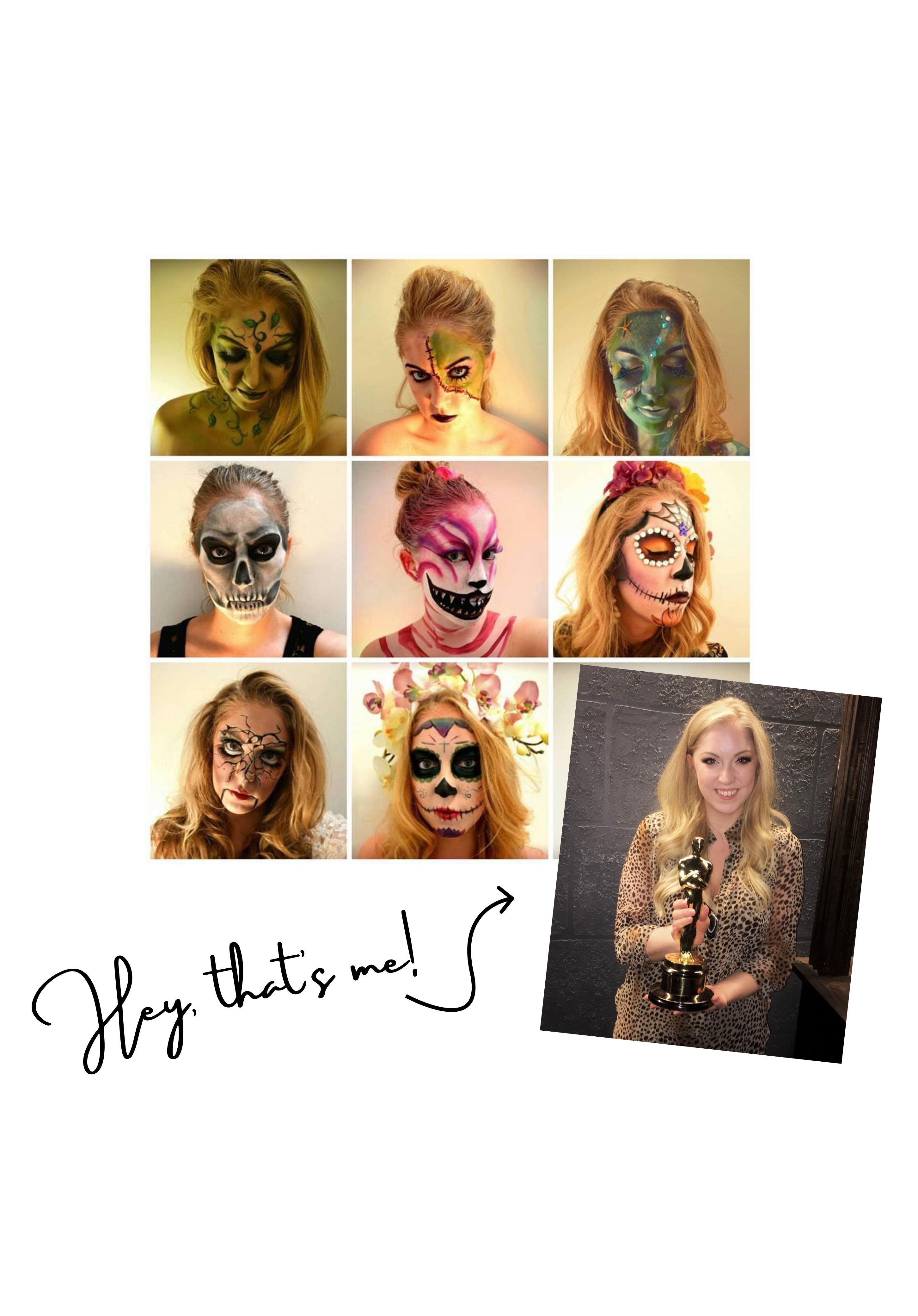
As a makeup artist, I have firsthand experience with cosmetics used in film and television. When I realized that certain pigments shouldn't be used near one's eyes or mouth, I started a deep dive into what we are really putting on our bodies. After the lawsuits against Johnson & Johnson regarding asbestos contamination in baby powder years ago, I started checking ingredients in my products. If you've ever done the same, you know that they are nearly impossible to decipher unless you're a chemist.
My Mission? I want to delve into what these common toxic chemicals are, what they do to our bodies, and how we can avoid them in our daily lives.
The David Suzuki Foundation refers to “The Dirty Dozen”: the worst 12 toxins commonly found in personal care and cosmetic items. Read more here.
80% of products tested in Canada tested positive for at least 1 toxic chemical
595 cosmetics manufacturers since 2009 have reported using 88 chemicals, in more than 73,000 products, that have been linked to cancer, birth defects, or reproductive harm.
Research
As I started my research, I made certain assumptions that shaped the project:
1. Women prioritize convenience over the product’s ingredients.
2. Consumers feel overwhelmed when researching brands and ingredients.
3. Users prefer "clean" products without necessarily understanding why.
4. Consumers put a lot of trust in the labelling process, especially from big companies.
To test these assumptions, I initiated user interviews:
I engaged participants aged 20 to 80 who use personal care items daily. While some were environmentally conscious, others were simply looking for safer products. The revelation from these interviews was eye-opening. Every single participant confirmed my initial hypothesis: consumers were in the dark about what they were applying to their bodies.
Notably, I discovered that my assumption about trust in product labeling was inaccurate. 4 in 5 participants placed little to no trust in ingredients lists, casting doubt on the industry's transparency.
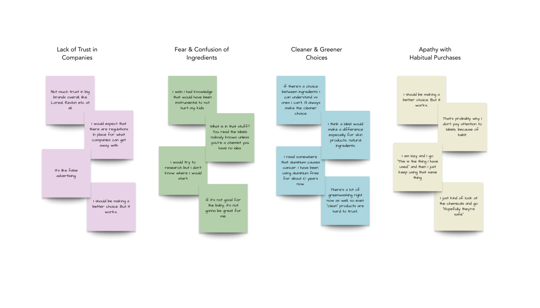
The affinity mapping process helped me distill these insights into four main themes:
Lack of Trust in Companies and Labels: Users felt skepticism towards labels and the companies behind them.
Confusion and Fear of Ingredients: Many were confused by the ingredients listed and had concerns about potential harm.
Shopping for Green Products with Cleaner Ingredients: Participants were inclined towards eco-friendly and cleaner options.
Apathy with Habitual Purchases: Users often relied on habitual buying patterns, unconcerned about the ingredients in their tried and true products.
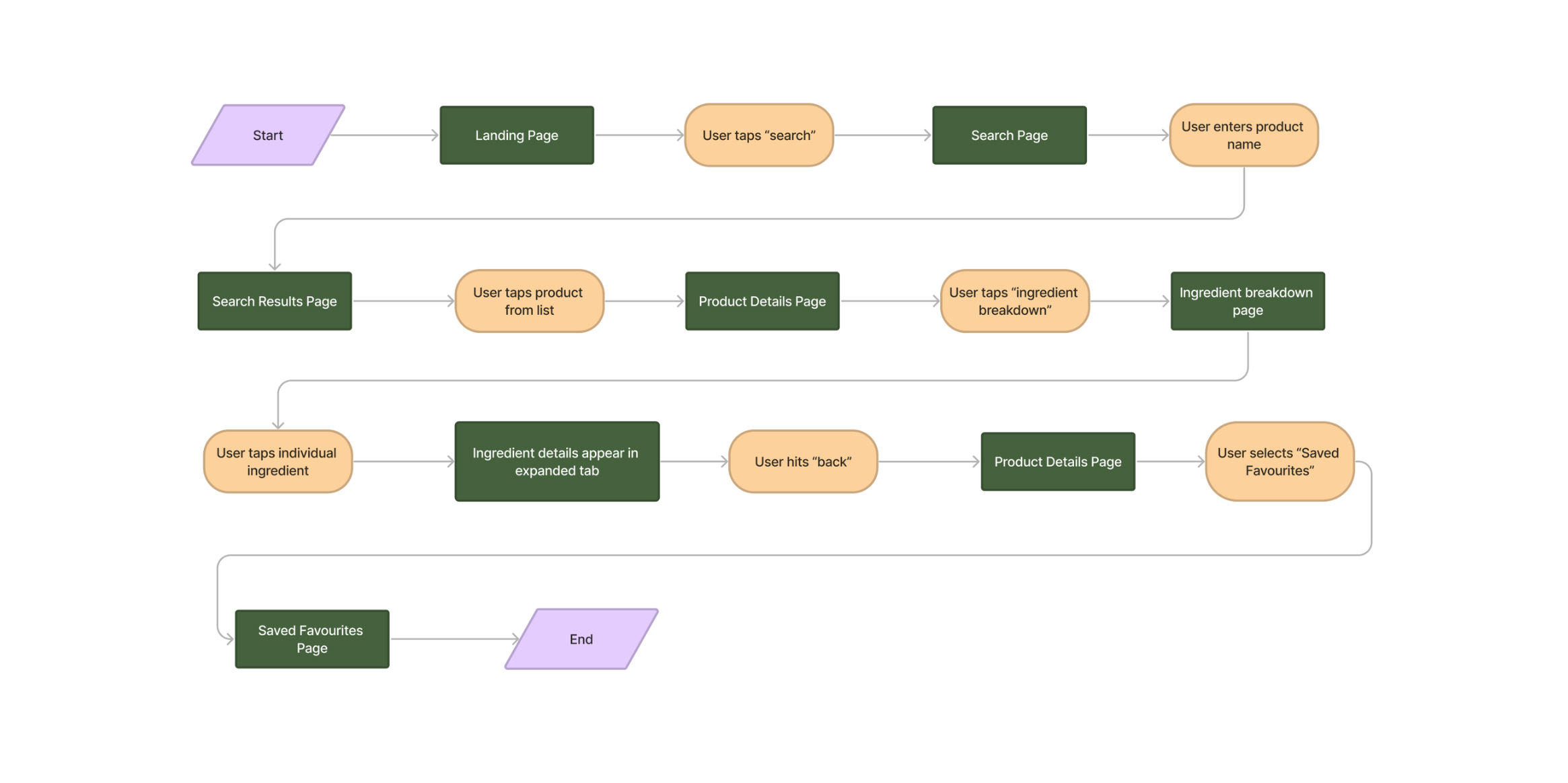
With these themes in mind, I crafted a task flow and user story:
"As a user, I want to learn what ingredients are in my personal care product so that I can feel safe using them."
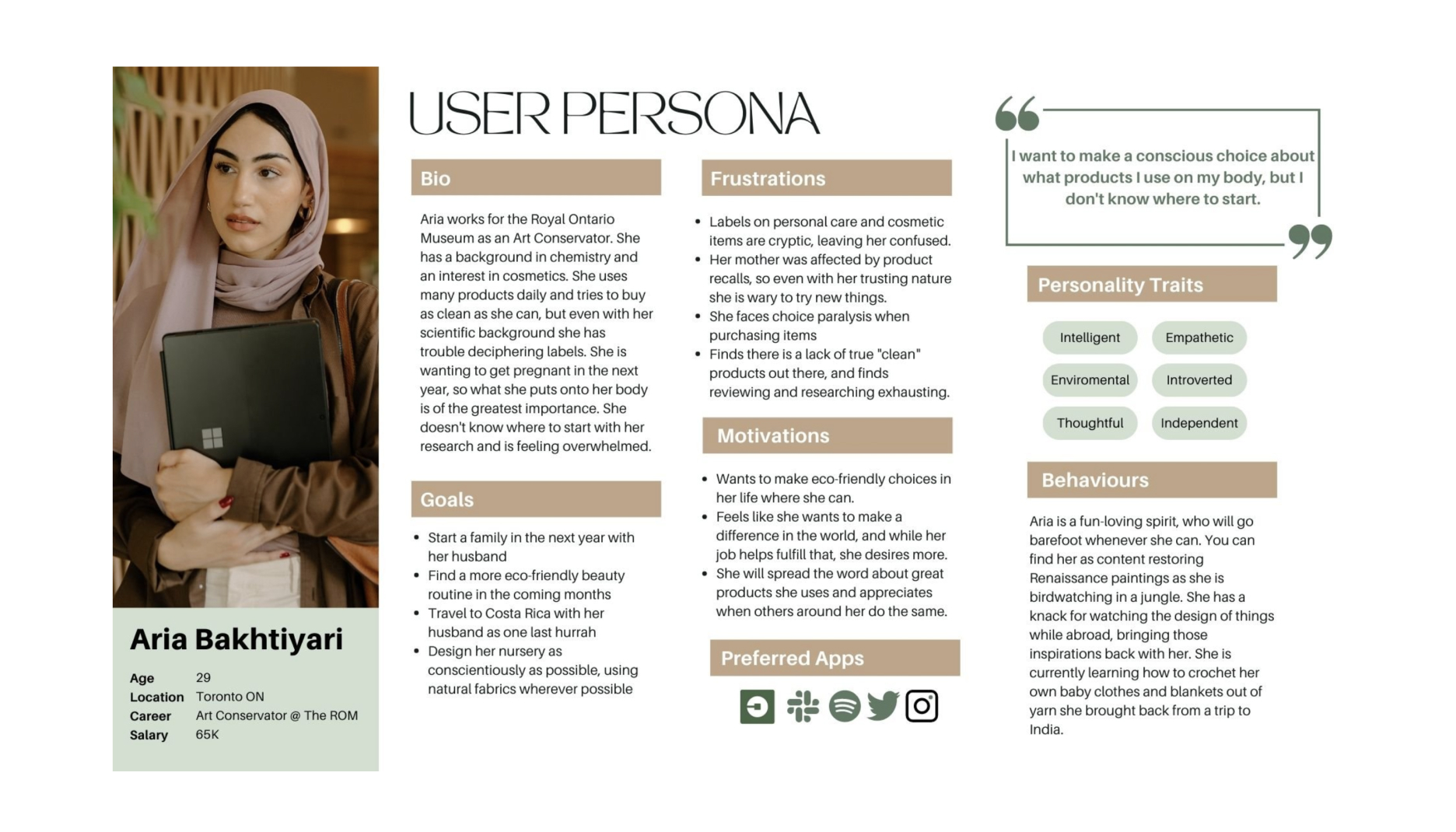
After interviewing respondents I have compiled their insights, plus secondary research, into a primary user. When solving problems going forward, we can refer back to our persona, Aria, to stay focused on what the breadth of users want.
Development
Turning my gaze to the design phase, I sought inspiration from luxury brands. I researched a breadth of websites for inspiration, focusing in on luxury brands. Angular details, simple details, natural elements, glass morphism, and elegant typefaces.
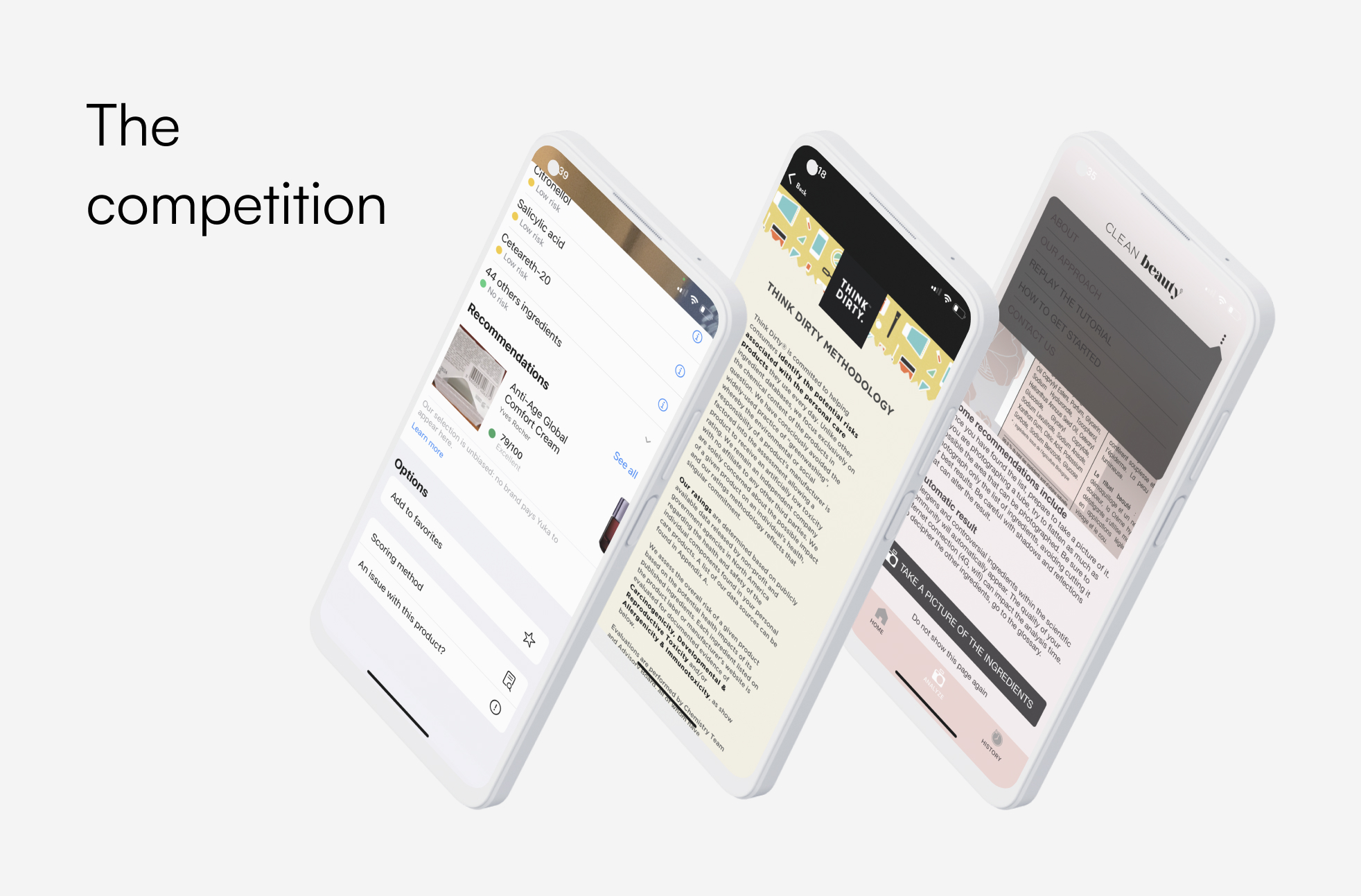
Before crafting La Belle's UI, I undertook a thorough competitive analysis.
Existing applications in this domain are often compiled of complex and cluttered interfaces that don't offer an enjoyable user experience. I wanted La Belle to change that.
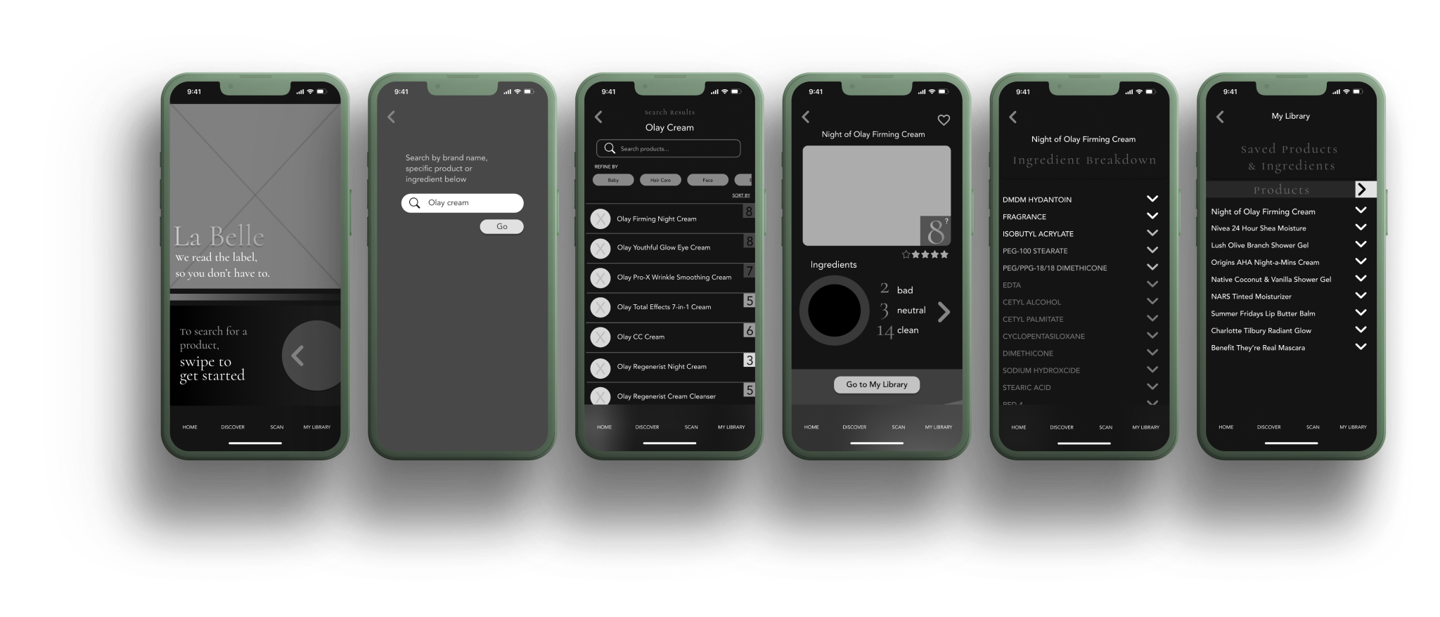
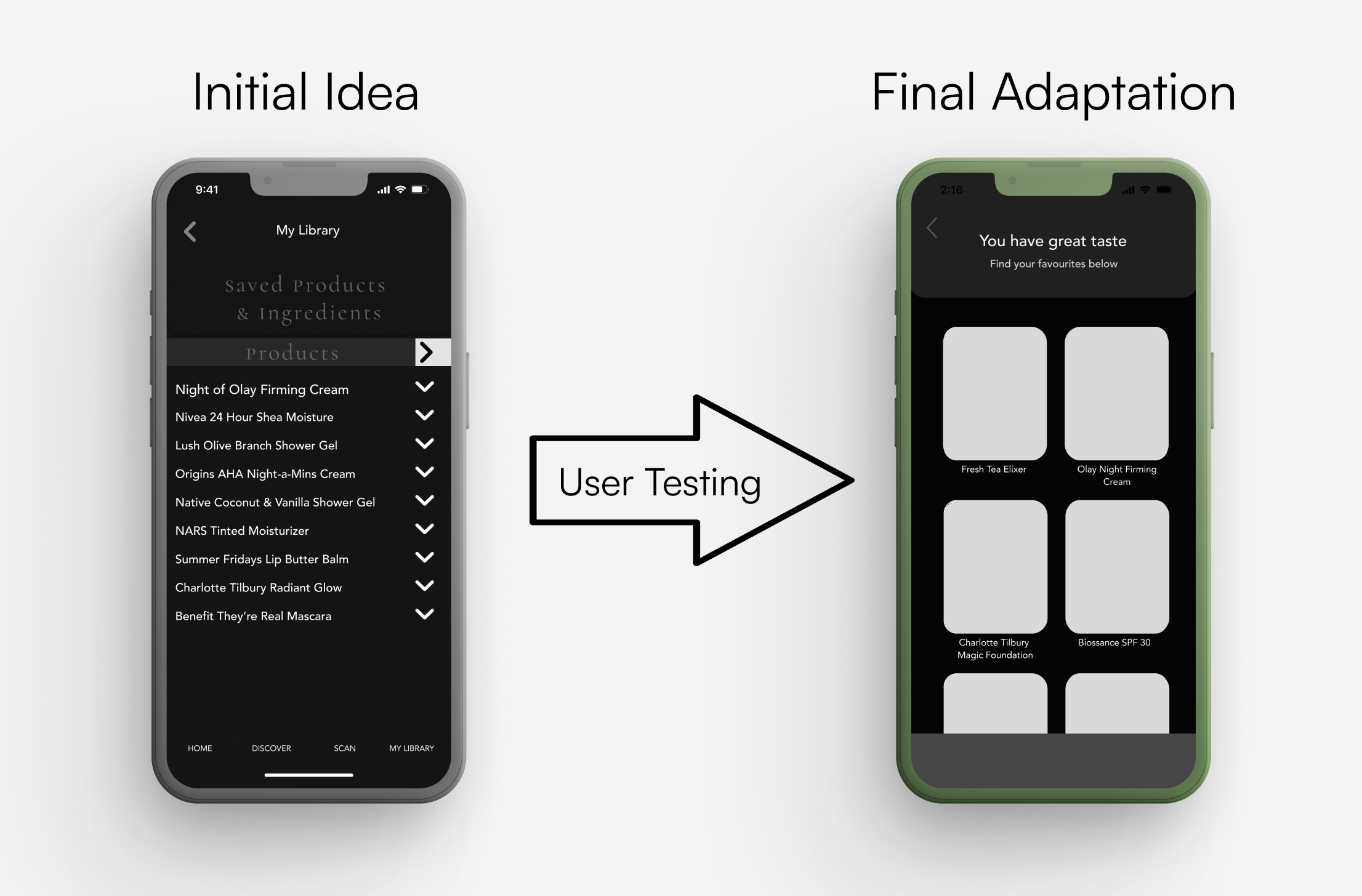
I went through 2 rounds of user tests, with 10 unique testers. I was humbled by user testing to say the least. What I thought was easy and intuitive was anything but that. All testers failed to swipe left and right to see more of their saved items. This was a high priority fix that needed addressing immediately. It was a hard stop that took precious time, but well worth the effort.

Creative Direction
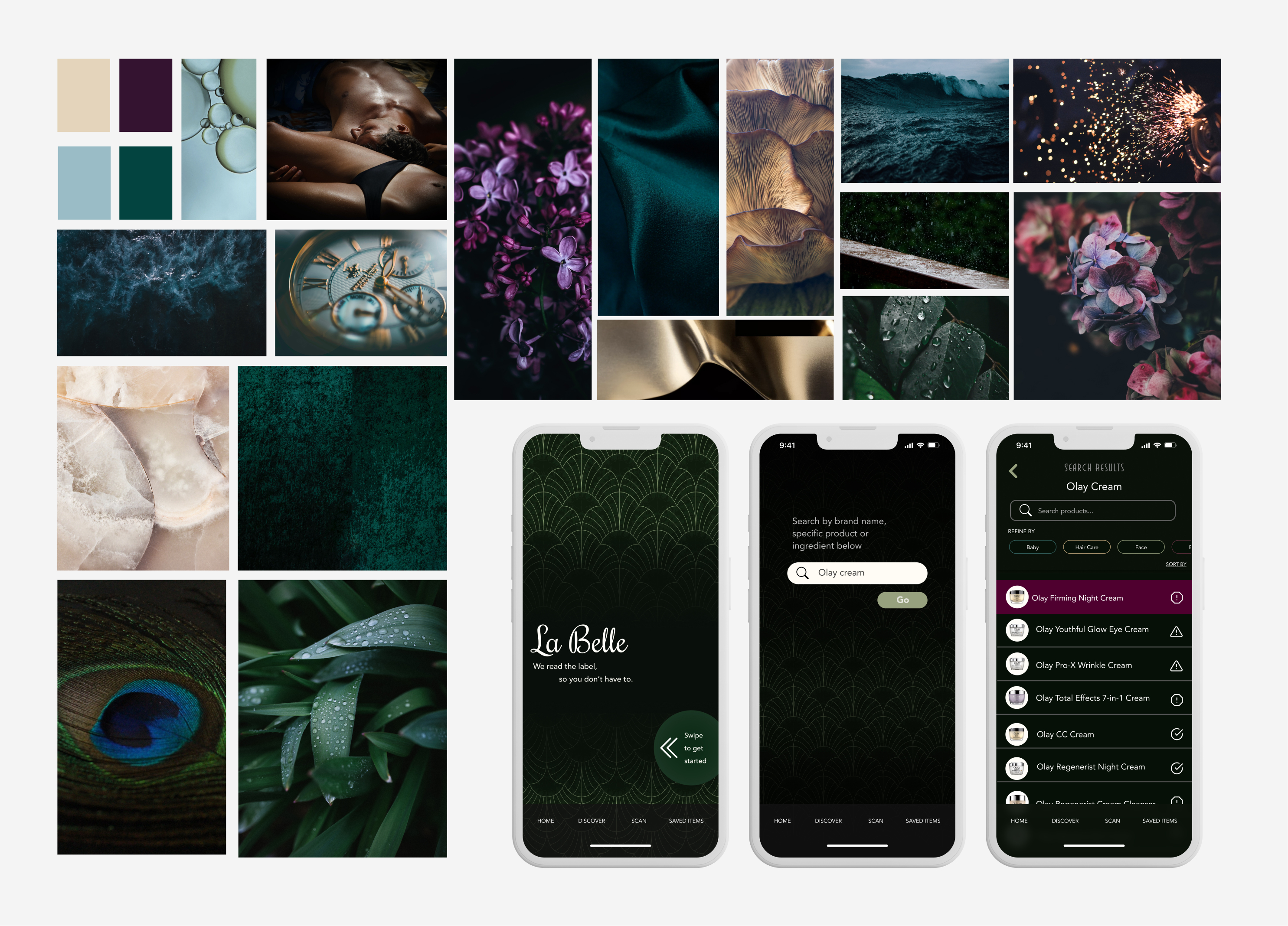
My first direction was towards Art Deco, dark rich jewel tones, moody visuals. While the initial dark mode design didn't resonate with me, it led to a refreshing change.
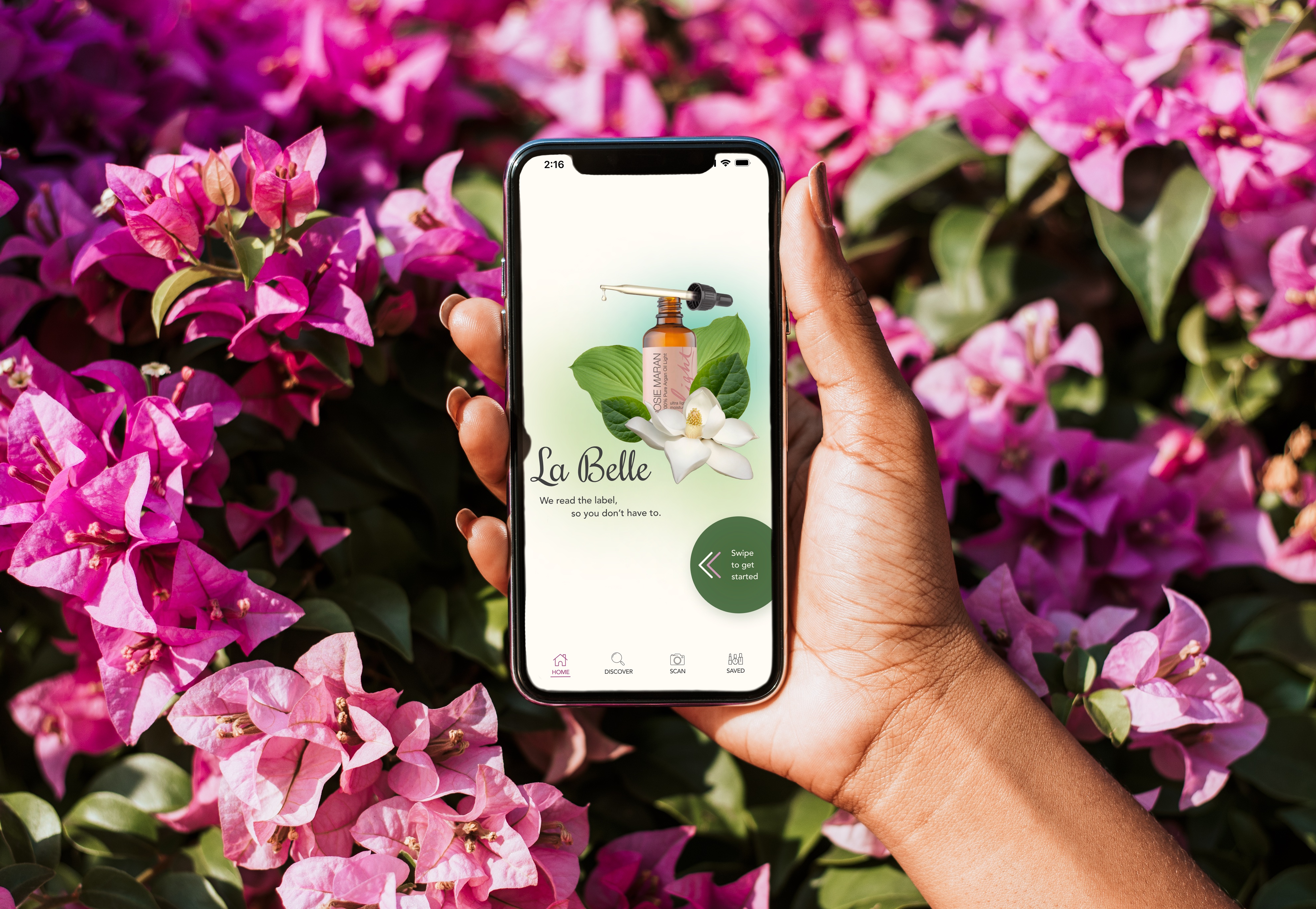
I transitioned towards a brighter, nature-inspired palette, emphasizing soft and calming tones. My design direction found inspiration in nature, botanicals, and the serenity of a spa.
The brand image drew inspiration from the local flower shop, incorporating botanical elements that would infuse beauty into users' daily lives. My aim was to create an application that people would genuinely want to use.
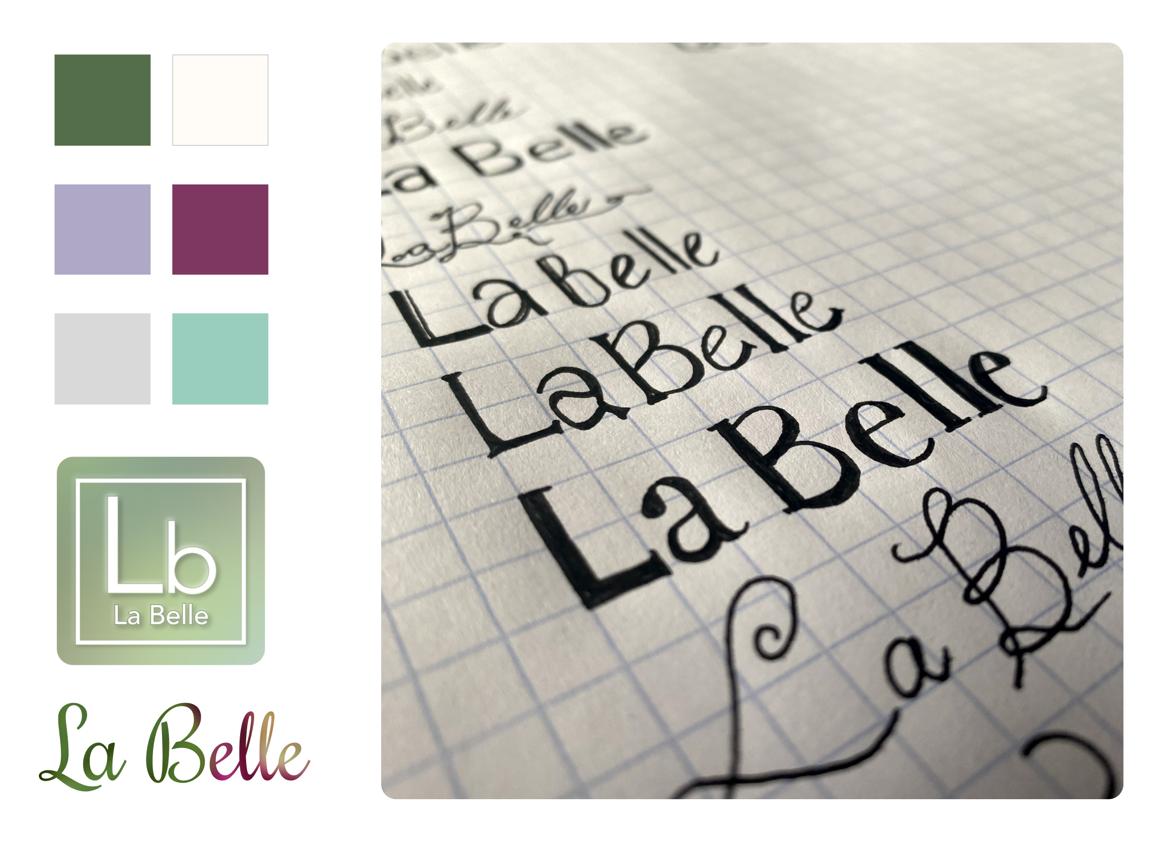
I played with the name of this application for awhile, but La Belle as a play on the word “Label” always had my heart. It was my first ideation and, in my opinion, the best. Sometimes you have to trust your gut. A fellow designer lent me his calligraphy pen, which was a huge inspiration for the overall design of the wordmark.
The application icon was inspired by the Periodic Table of Elements, and was a way to work chemistry into the brand.

With every element aligned, from colours to typography, it infused personality into the application. La Belle began to feel like a friend users could turn to for guidance. I’m excited for you to meet her.
Marketing Campaign
La Belle was created, but how do we get it into people’s hands? That’s where a marketing site comes into play.
I kept the colours true to the application, soft and vibrant florals and punchy copy to grab the consumer’s attention.
View Marketing Web Design Here.
Key Learnings
I learned that people are very frustrated and confused by the labels they currently see. This has led to a sense of hopelessness and apathy across the board. People care; they want to buy cleaner products but don't know where to start. Further, I learned that the range of products used daily can vary widely. With many do not immediately consider things like body wash, toothpaste and hair care to be harmful in the ways that they use them.
Testing is vital to the process. The saying "fail early, fail often" was apt here. My entire "saved items" flow was broken upon the first testing round. That's okay, honestly the app is better for it now. I am grateful for the feedback provided. Competitive analysis helped a great deal as well, there are applications doing a similar idea to La Belle, and it was fascinating delving into how and why they chose their UI, flows and user experience.

Next Steps
Looking ahead, I plan to expand La Belle's capabilities.
Scanning barcodes for quick product information retrieval is in the works, making it convenient for users on the go. Additionally, I aim to provide more information, including product bans and recalls.
Furthermore, a robust business plan is on the horizon. La Belle's revenue model will encompass advertising and subscription services, targeting a specific demographic with unique features that differentiate it from competitors. With strong marketing and a successful launch, La Belle aspires to carve its place in the beauty industry, ensuring consumers are empowered with information, and no longer in the dark about what they put on their skin.

